4. METexpress Apps
This section includes a description of the unique features of each app.
4.1. Upper Air App
The Upper Air app is designed for plotting scalar and contingency table statistics at different pressure levels in the atmosphere.
The user interface for Upper Air follows the general description from above. Choices specific to this app are shown below.
Choices for Statistic (depending on available line types):
RMSE
Bias-corrected RMSE
MSE
Bias-corrected MSE
ME (Additive bias)
Fractional Error
Multiplicative bias
Forecast mean
Observed mean
Forecast stdev
Observed stdev
Error stdev
Pearson Correlation
Forecast length of mean wind vector
Observed length of mean wind vector
Forecast length - observed length of mean wind vector
abs(Forecast length - observed length of mean wind vector)
Length of forecast - observed mean wind vector
Direction of forecast - observed mean wind vector
Forecast direction of mean wind vector
Observed direction of mean wind vector
Angle between mean forecast and mean observed wind vectors
RMSE of forecast wind vector length
RMSE of observed wind vector length
Vector wind speed MSVE
Vector wind speed RMSVE
Forecast mean of wind vector length
Observed mean of wind vector length
Forecast stdev of wind vector length
Observed stdev of wind vector length
The Upper Air app includes functionality for these types of plots:
Time Series
Profile
Dieoff
ValidTime
Histogram
Contour
The Upper Air app includes the following plot types.
Time Series: The default plot type is Time Series, which has date on the x-axis and the mean value of the selected parameter for that date on the y-axis.
Profile: The Profile plot type displays pressure level on the y–axis and the mean value of the selected parameter on the x-axis.
Die-off: Die-off plots show how skill (or the inverse, error) changes with increasing lead time. Figure 4.1 shows the user interface page after selecting the plot type of Dieoff. Note that another selector is included for DIEOFF TYPE, which has the following possible values:
Dieoff
Dieoff for a specific UTC cycle start time
Single cycle forecast
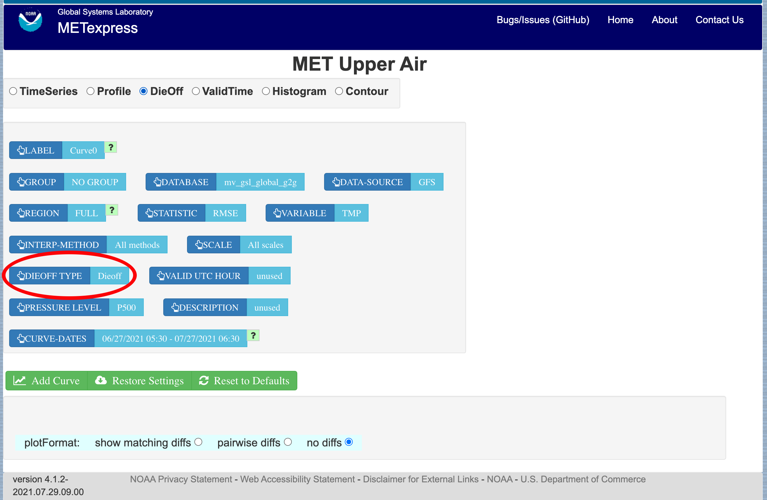
Figure 4.1 User Interface screen after selecting plot type of Dieoff.
Figure 4.2 shows a sample of a Dieoff plot in METexpress. This looks more like a familiar die-off curve when plotting skill, such as anomaly correlation as plotted in Figure 4.3 using the Anomaly Correlation app, rather than error as is plotted with the Upper Air app.
The option “dieoff” for Dieoff Type uses all data at each given forecast hour within the specified date range. The option for “Dieoff for a specific UTC cycle start time” filters data to only use those at a specified cycle initialization time, such as 0 or 12. The option “Single cycle forecast” uses only the forecasts from the first cycle in the specified date range.
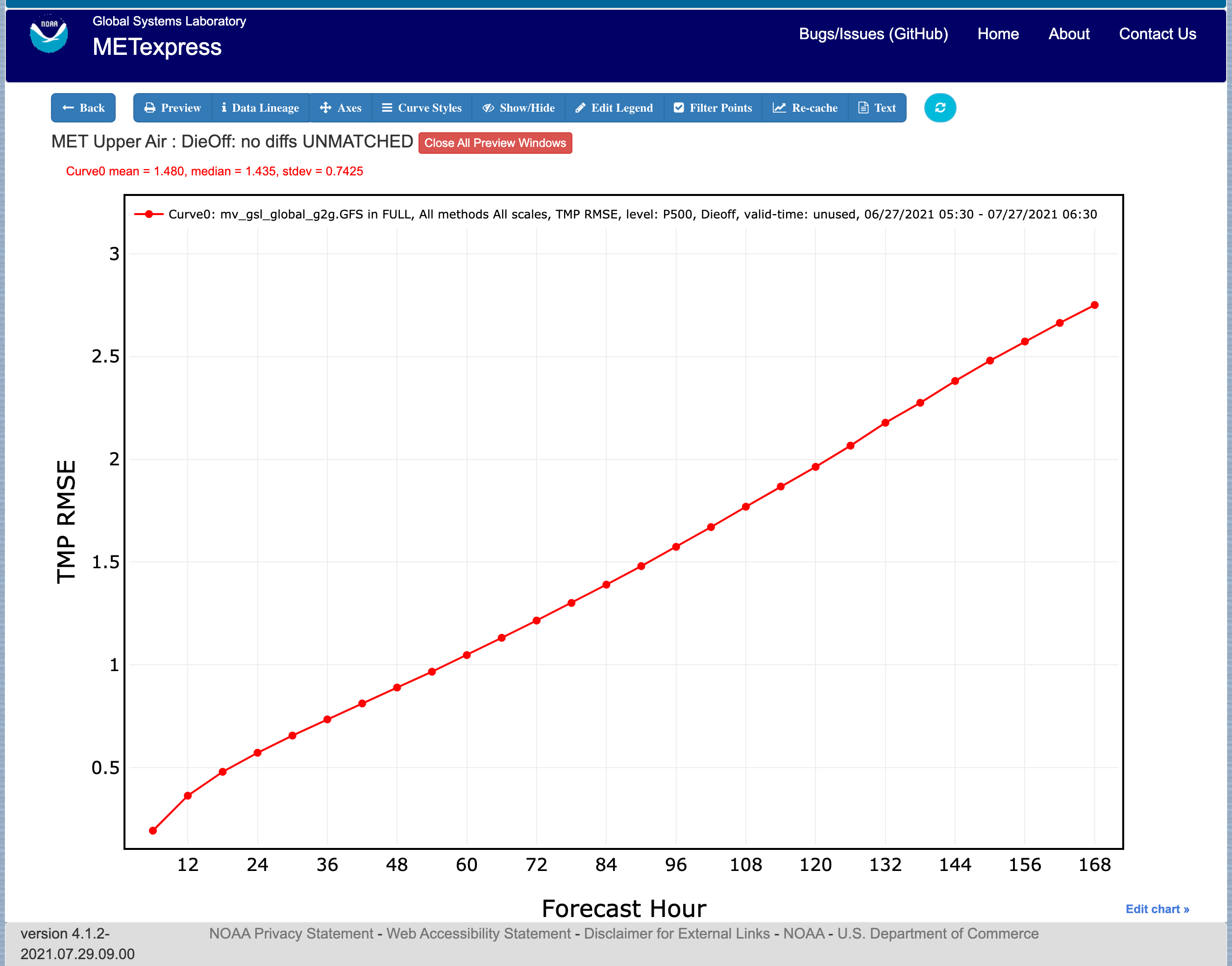
Figure 4.2 Upper Air Dieoff plot
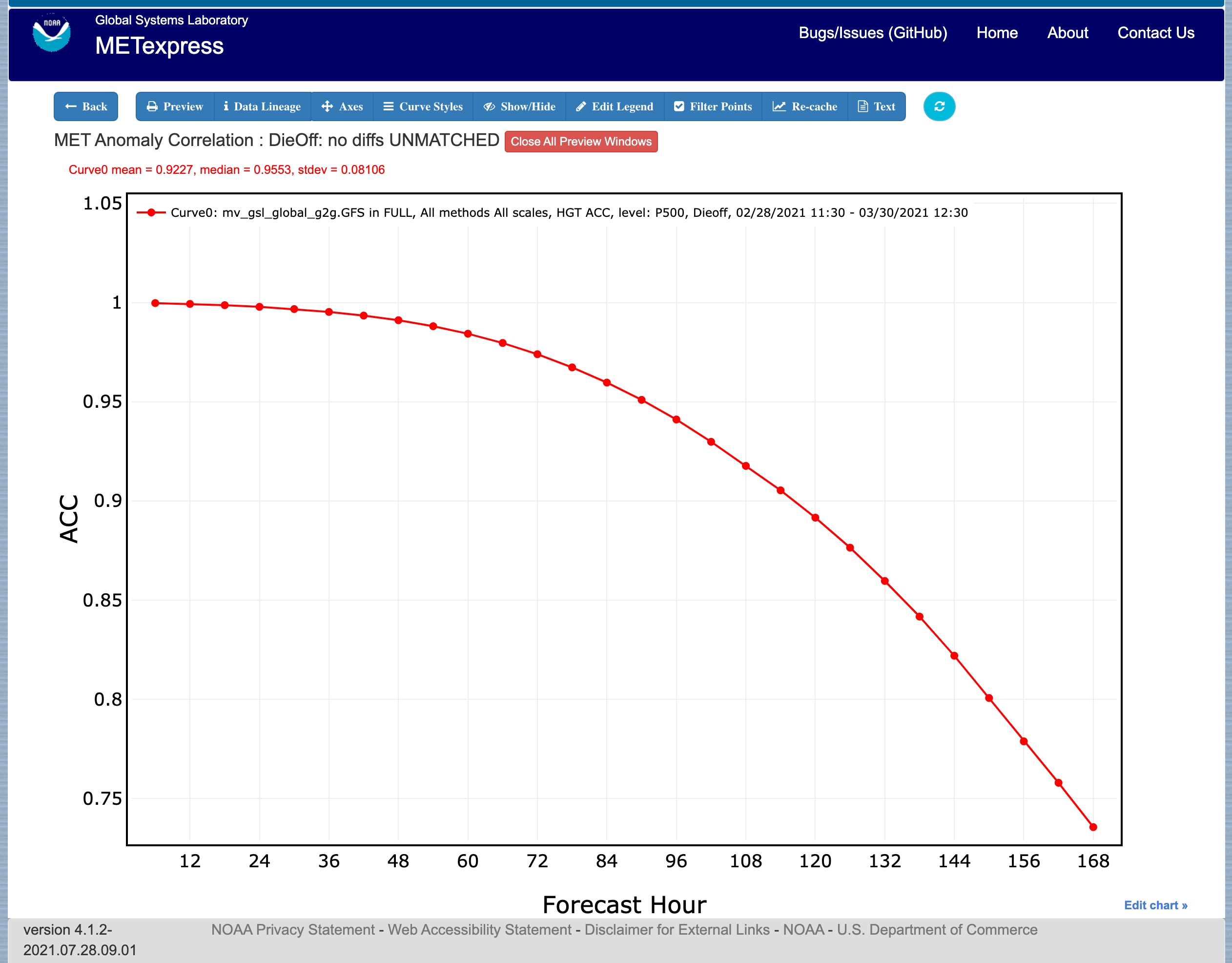
Figure 4.3 Anomaly Correlation Dieoff plot
ValidTime: The ValidTime plot type (also sometimes known as diurnal cycle plots) displays valid UTC hour on the x–axis and the mean value of the selected parameter on the y-axis.
Histograms: Histograms allow users to visualize the distribution of a given statistic over a specified time period. For example, if a user requested a histogram of RMSE for 144-h GFS forecasts over the global domain for a month, they would see the frequencies of specific RMSE values produced by individual GFS runs over that month. Histograms have statistical value bins on the x-axis, and number or frequency counts on the y-axis.
Histograms have a number of additional selectors that control their appearance:
Y-axis mode: Can be set to either “Relative frequency” or “Number”, depending on whether a user wants the frequency of a given statistic displayed as a fraction of 100, or as a raw count.
Customize bins: With this selector, the user can choose one of the following options to customize their x-axis bins:
Default bins
Set number of bins
Has sub-selector “Number of bins”
Make zero a bin bound
Choose a bin bound
Has sub-selector “Bin pivot value”
Set number of bins and make zero a bin bound
Has sub-selector “Number of bins”
Set number of bins and choose a bin bound
Has sub-selectors “Number of bins” and “Bin pivot value”
Manual bins
Has sub-selector “Bin bounds”
Manual start, number, and stride
Has sub-selectors “Number of bins”, “Bin start”, and “Bin stride”
Figure 4.4 shows the user interface for histogram plots and Figure 4.5 shows a sample plot.
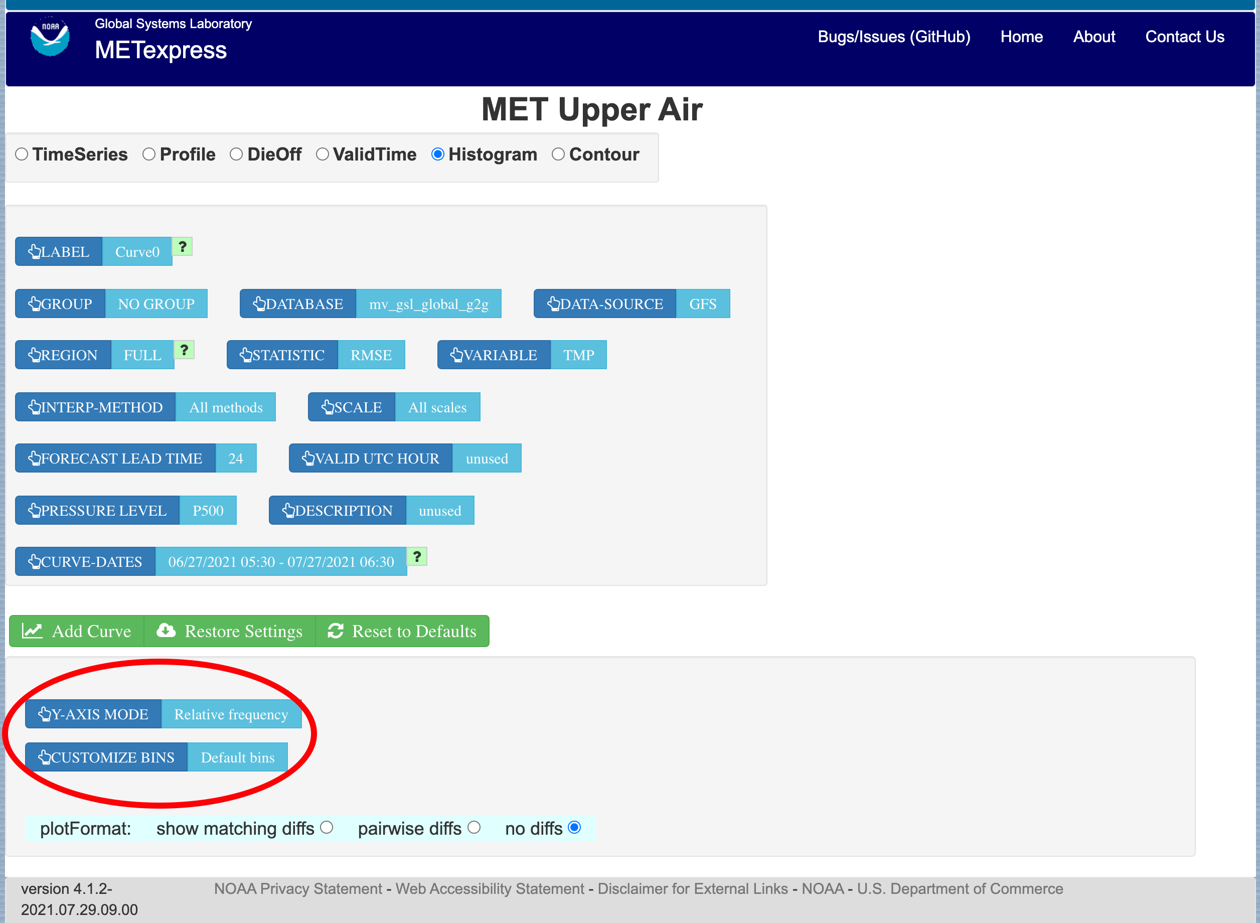
Figure 4.4 The user interface for histogram plots.
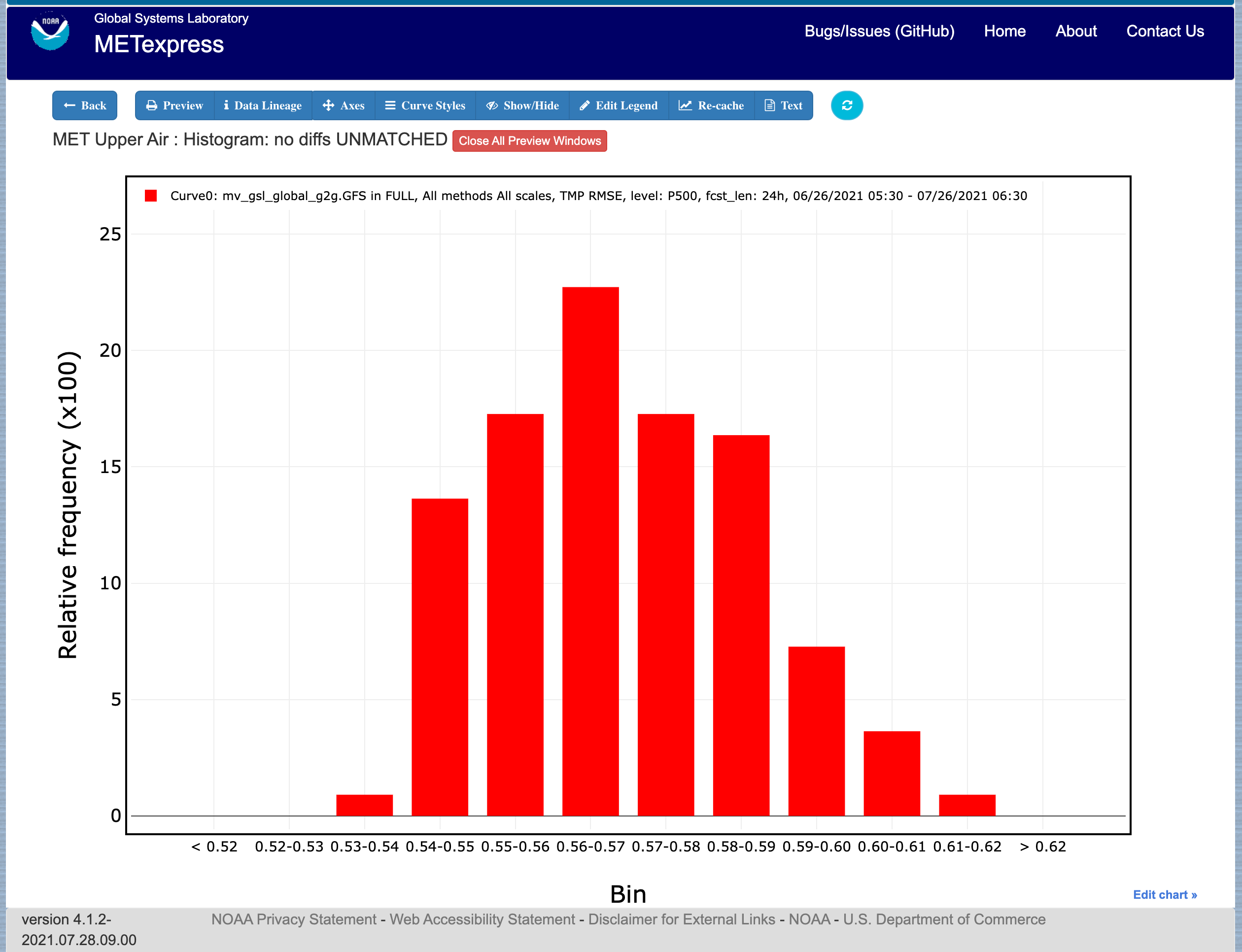
Figure 4.5 Plot generated from selections in Figure 4.4
Contour: Contour plots can be used in many ways. One can illustrate data with respect to height, as in plots seen at http://www.emc.ncep.noaa.gov/gmb/STATS_vsdb/, which have height on the y-axis and forecast hour (as in lead time) on the x-axis. These VSDB stat plots can be easily replicated in METexpress by using the contour plot type, except that the plot in METexpress will have only one pane, not two. In addition, METexpress users are not bound to have only pressure level / height on the y-axis or forecast lead time on the x-axis. They can reverse the two, place valid or init UTC hour on one of the axes, create Hovmoller diagrams, and many other combinations.
Contour plots have two additional selectors, x-axis-parameter and y-axis-parameter. With these, a user can decide which field to place on the x-axis (e.g. forecast lead time), and which to place on the y-axis (e.g. pressure level or valid UTC hour).
Figure 4.6 shows an example of an Upper Air profile plotted as a contour plot.
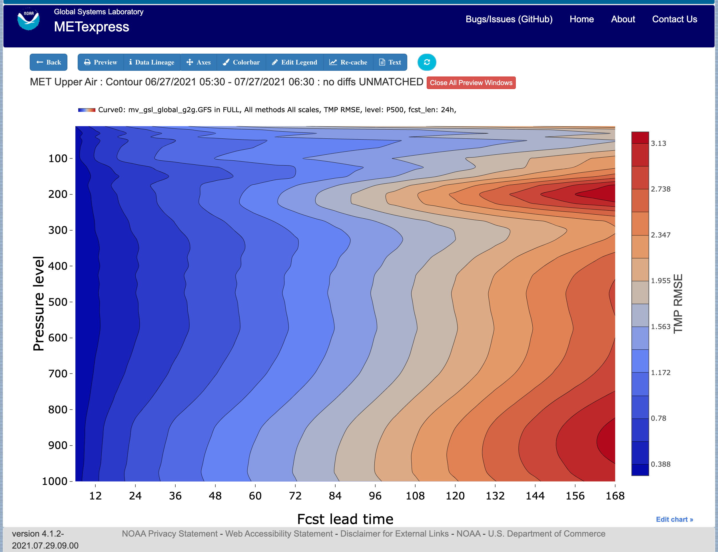
Figure 4.6 Upper Air profile, as a contour plot
4.2. Anomaly Correlation App
The Anomaly Correlation app is designed for plotting anomaly correlations at different pressure levels in the atmosphere, and at different heights above the ground.
An example of the Anomaly Correlation app user interface is shown in Figure 4.7 This interface is similar to the one for Upper Air but has fewer selectable parameters.
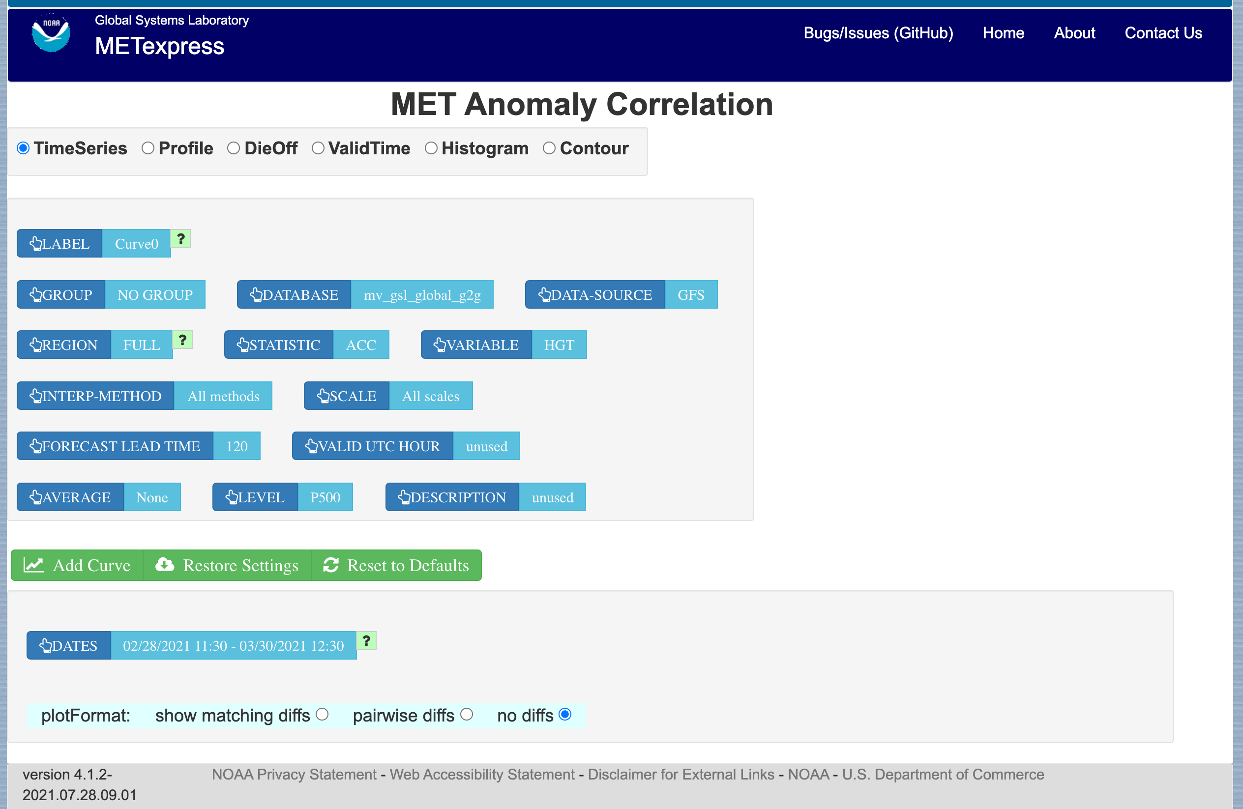
Figure 4.7 Anomaly Correlation app user interface
In this application, the selectable values are derived from the data for these parameters:
Group
Database
Data-Source
Region
Statistic
Variable
Interp-Method
Scale
Forecast lead time
Level
Description
Dates
Curve-dates
The selector for the Statistic has these possible choices (depending on available MET line types):
ACC
Vector ACC
Plot types available include
Time Series
Profile
Dieoff
ValidTime
Histogram
Contour
All plot types function the same here as they do in MET Upper Air described above. A sample anomaly correlation plot is shown in Figure 4.8.
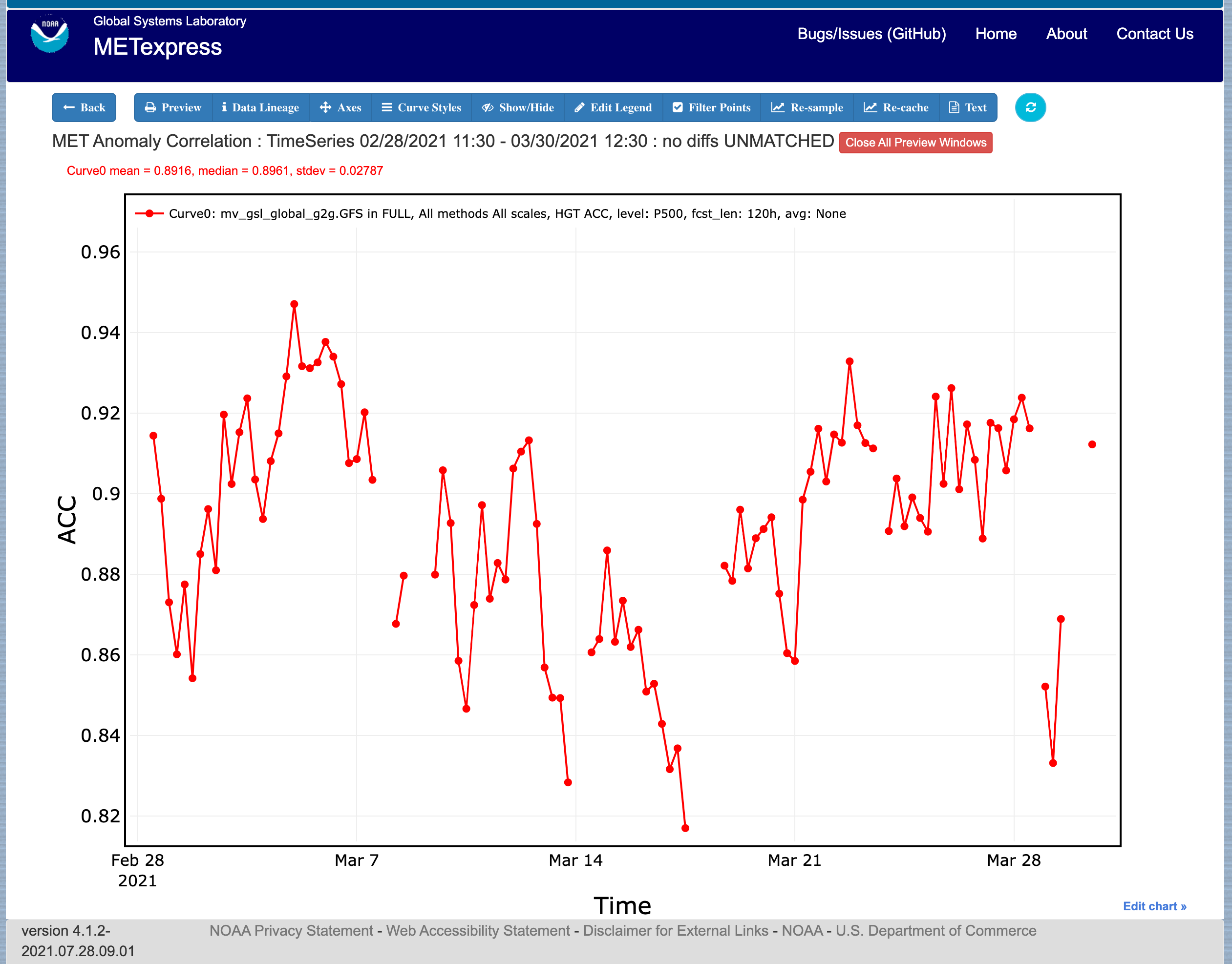
Figure 4.8 Anomaly Correlation sample plot.
4.3. Surface App
The Surface app is designed for plotting scalar and contingency table statistics at different heights above the ground.
The user interface for the Surface app is shown in Figure 4.9.
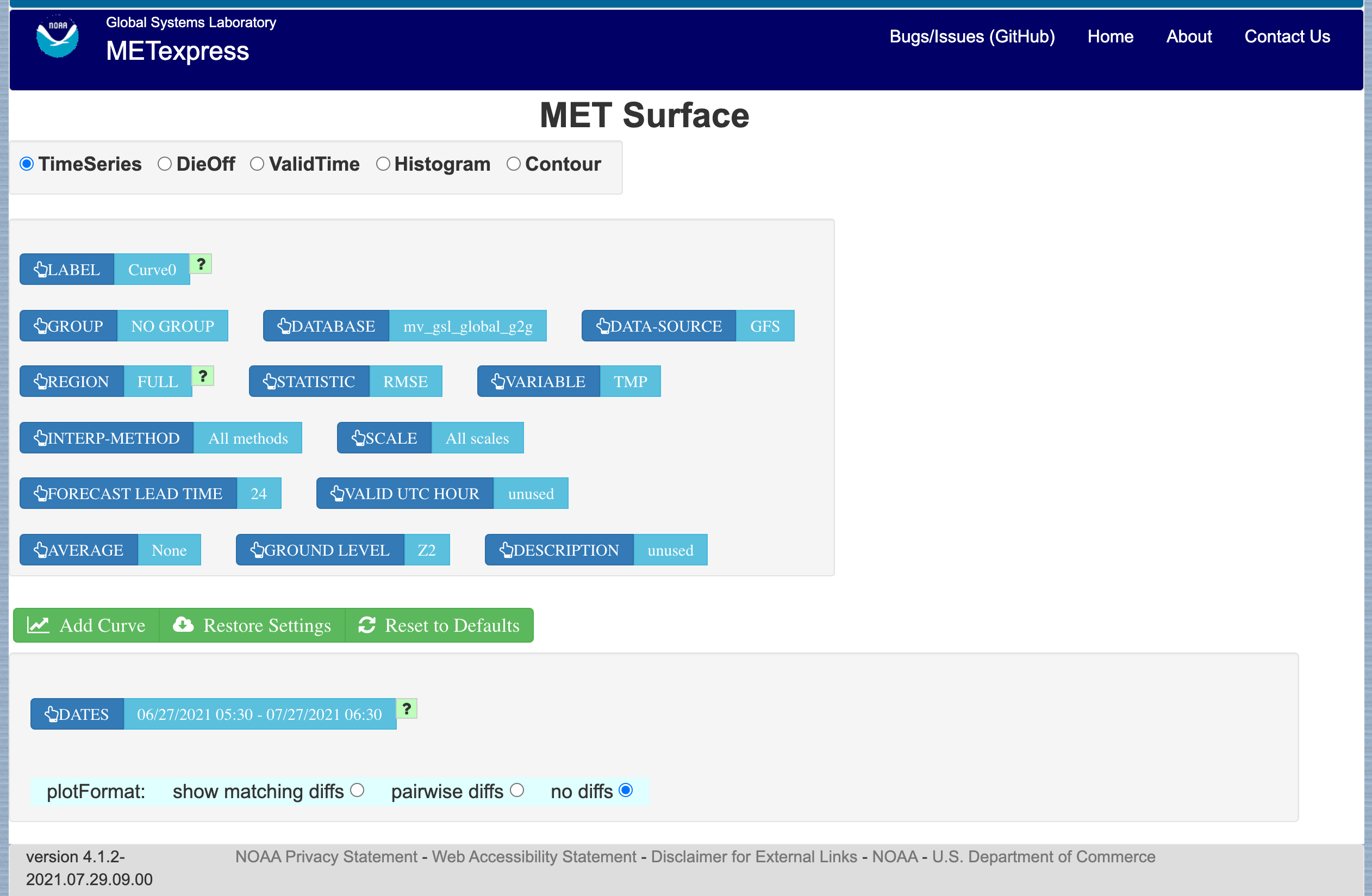
Figure 4.9 User Interface for the Surface app
For this app, the following parameters have choices derived from the data.
Group
Database
Data-source
Region
Statistic
Variable
Interp-Method
Scale
Forecast lead time
Ground level
Description
Dates
Curve-dates
The selector for the Statistic has these possible choices (depending on available MET line types):
RMSE
Bias-corrected RMSE
MSE
Bias-corrected MSE
ME (Additive bias)
Fractional Error
Multiplicative bias
Forecast mean
Observed mean
Forecast stdev
Observed stdev
Error stdev
Pearson Correlation
Forecast length of mean wind vector
Observed length of mean wind vector
Forecast length - observed length of mean wind vector
abs(Forecast length - observed length of mean wind vector)
Length of forecast - observed mean wind vector
Direction of forecast - observed mean wind vector
Forecast direction of mean wind vector
Observed direction of mean wind vector
Angle between mean forecast and mean observed wind vectors
RMSE of forecast wind vector length
RMSE of observed wind vector length
Vector wind speed MSVE
Vector wind speed RMSVE
Forecast mean of wind vector length
Observed mean of wind vector length
Forecast stdev of wind vector length
Observed stdev of wind vector length
Plot types available include:
Time Series
Dieoff
ValidTime
Histogram
Contour
Plots in the Surface app for Time Series, Dieoff, ValidTime, Histogram, and Contour are the same as in Upper Air. An example of a Valid Time plot is shown in Figure 4.10.
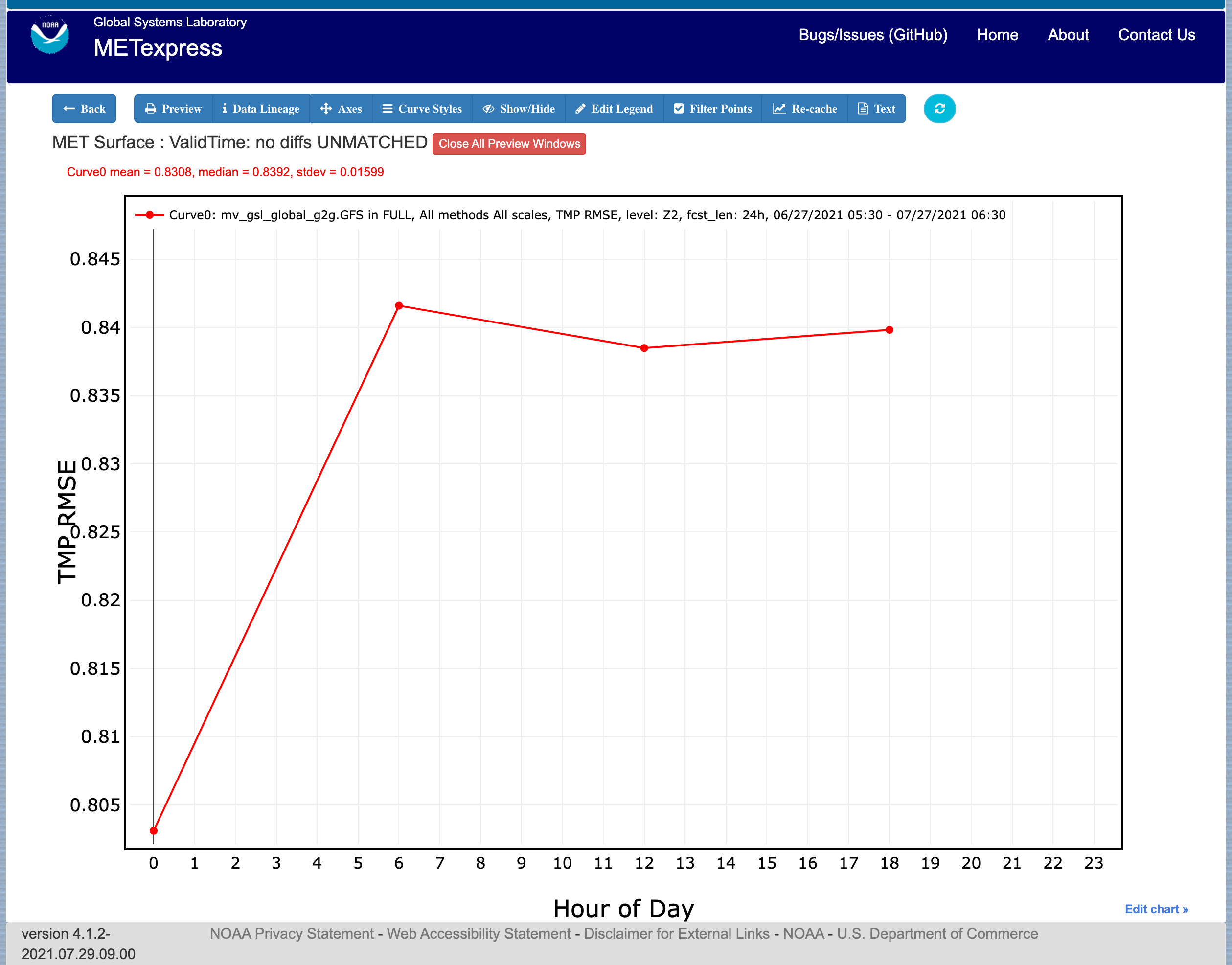
Figure 4.10 Surface app ValidTime plot
4.4. Air Quality App
Similarly to the Surface app, the Air Quality app is designed for plotting scalar and contingency table statistics at different heights above the ground, but with a focus on variables related to air quality.
For this app, the following parameters have choices derived from the data.
Group
Database
Data-source
Region
Statistic
Variable
Threshold
Interp-Method
Scale
Forecast lead time
Ground level
Description
Dates
Curve-dates
The selector for the Statistic has these possible choices (depending on available MET line types):
CSI
FAR
FBIAS
GSS
HSS
PODy
PODn
POFD
RMSE
Bias-corrected RMSE
MSE
Bias-corrected MSE
ME (Additive bias)
Fractional Error
Multiplicative bias
Forecast mean
Observed mean
Forecast stdev
Observed stdev
Error stdev
Pearson Correlation
Plot types available include
Time Series
Dieoff
Threshold
ValidTime
Histogram
Contour
Plots in the Air Quality app for Time Series, Dieoff, ValidTime, Histogram, and Contour are the same as in Upper Air.
An additional plot type, Threshold, is available in this app. Threshold plots display threshold on the x-axis, and the mean value of the selected parameter on the y-axis.
Figure 4.11 shows an example of an Air Quality Threshold plot.
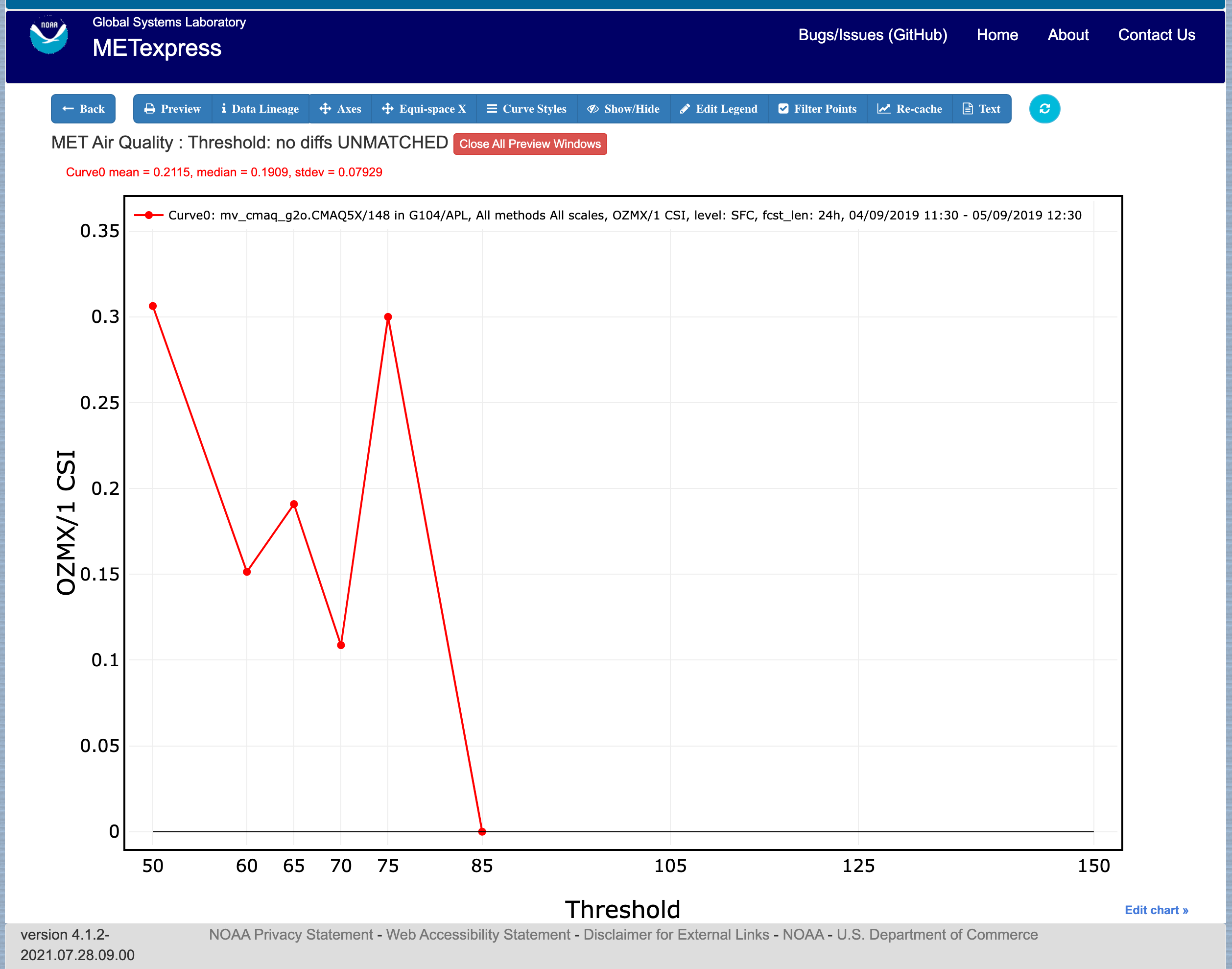
Figure 4.11 Air Quality app Threshold plot
4.5. Ensemble App
The Ensemble app is designed for plotting scalar and contingency table statistics, as well as ensemble metrics, for multi-member ensemble model runs.
For this app, the following parameters have choices derived from the data.
Group
Database
Data-source
Region
Statistic
Variable
Forecast lead time
Level
Description
Dates
Curve-dates
The selector for the Statistic has these possible choices (depending on available MET line types):
RMSE
RMSE with obs error
Spread
Spread with obs error
ME (Additive bias)
ME with obs error
CRPS
CRPSS
MAE
BS
BSS
BS reliability
BS resolution
BS uncertainty
BS lower confidence limit
BS upper confidence limit
ROC AUC
FSS
Plot types available include
Time Series
Dieoff
ValidTime
Histogram
Ensemble Histogram
Reliability
ROC
Performance Diagram
Plots in the Ensemble app for Time Series, Dieoff, ValidTime, and Histogram are the same as in Upper Air.
Four plot types are specific to this app: Ensemble Histogram, Reliability, ROC, and Performance Diagram.
Ensemble Histograms are controlled by the Histogram type selector that appears at the bottom of the main app page when the plot type of Ensemble Histogram is selected. This can be set to Rank Histogram, Probability Integral Transform Histogram, or Relative Position Histogram. Selecting one of these will produce the corresponding plot, with bins pre-calculated in the MET verification process. As with regular histogram plots, the user has the option of setting the Y-axis mode to either “Relative frequency” or “Number”.
Reliability plots produce a single curve for the chosen parameters (probabilistic variables only), with Forecast Probability on the x-axis, and Observed Relative Frequency on the y-axis. Four additional lines will be displayed on the graph, denoting perfect skill, no skill, x climatology, and y climatology.
ROC plots can display multiple curves (probabilistic variables only), with False Alarm Rate on the x-axis, and Probability of Detection on the y-axis. An additional diagonal line will be displayed on the graph, denoting no skill.
Performance Diagrams can also display multiple curves (probabilistic variables only), with Success Ratio (1-FAR) on the x-axis, and Probability of Detection on the y-axis. Additional solid black curves are displayed on the graph to denote lines of constant bias, and additional dashed black curves are displayed on the graph to denote lines of constant CSI.
Figure 4.12 shows the user interface for defining an Ensemble Histogram and Figure 4.13 through Figure 4.15 show examples of the 3 types of Ensemble Histograms.
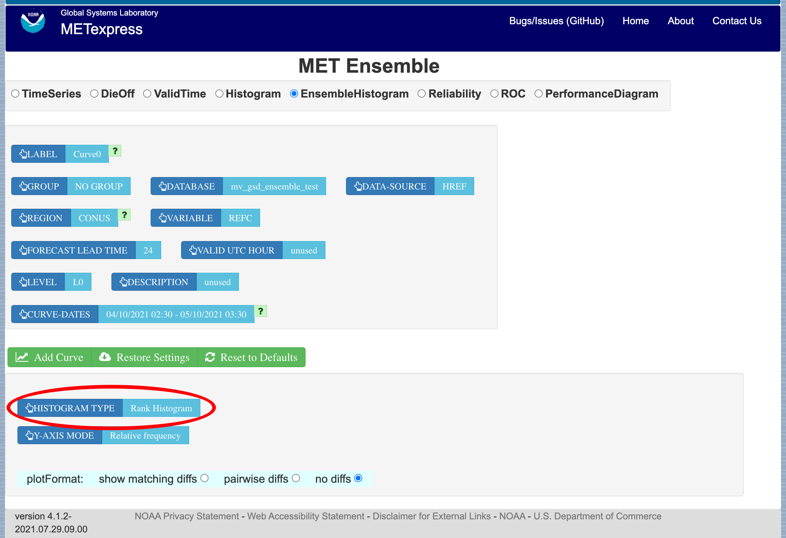
Figure 4.12 The Ensemble app user interface for Ensemble Histogram plots. Note the selector for Histogram Type which is unique to this plot type.
Figure 4.13 Ensemble Histogram plot type with Histogram Type of Rank Histogram.
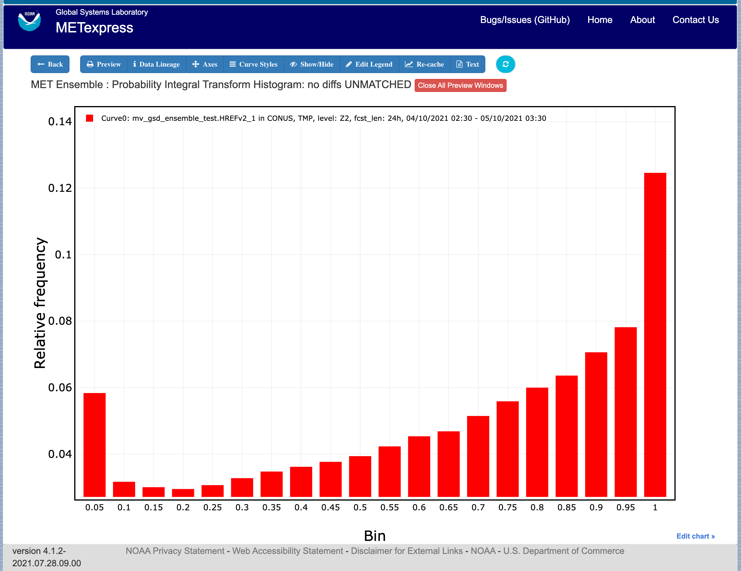
Figure 4.14 Ensemble Histogram plot type with Histogram Type of Probability Integral Transform Histogram.
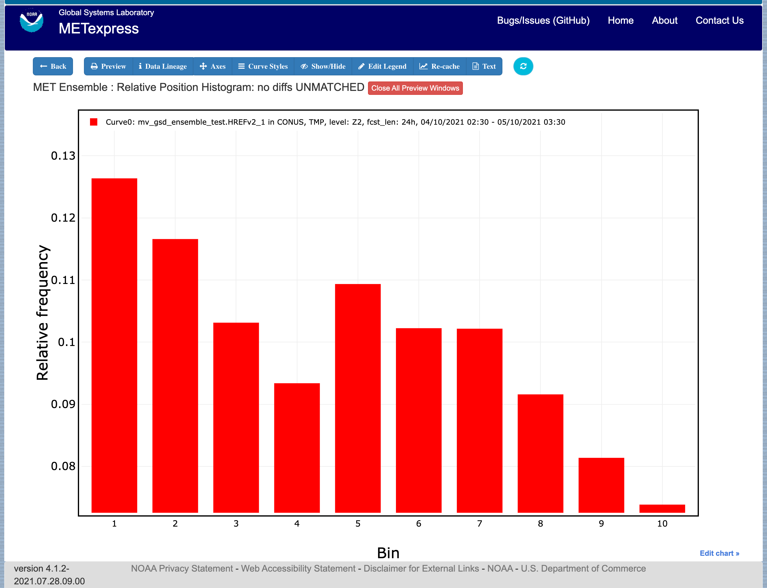
Figure 4.15 Ensemble Histogram plot type with Histogram Type of Relative Position Histogram
Figure 4.16 shows an example Reliability plot, Figure 4.17 shows an example ROC plot, and Figure 4.18 shows an example Performance Diagram, all for the same data set.
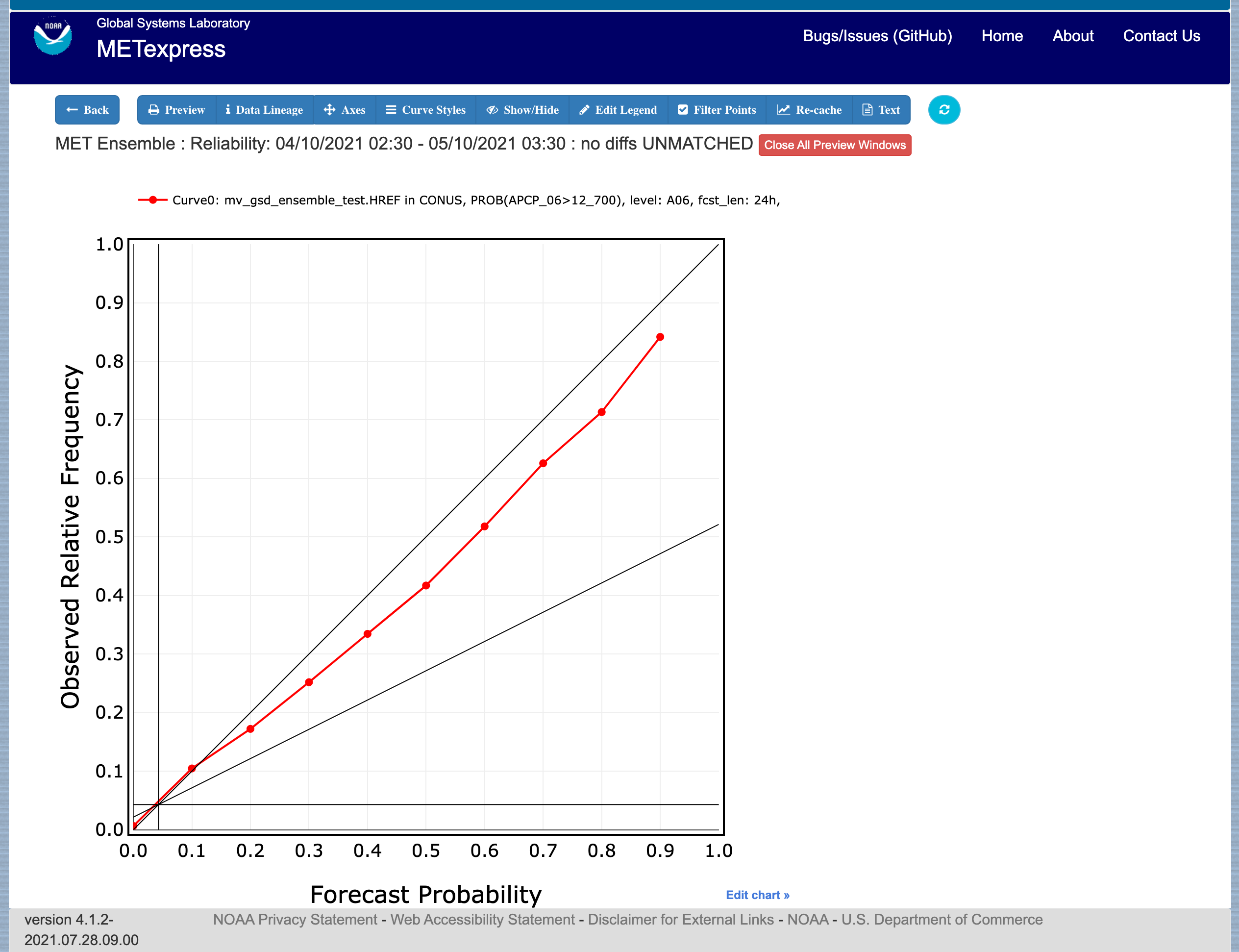
Figure 4.16 Ensemble app Reliability plot. The 1:1 diagonal gray line represents perfect skill between forecast probability and observation frequency. The diagonal line with the lower slope indicates the point above which the forecast becomes more skillful than climatology, and the vertical and horizontal lines indicate climatology.
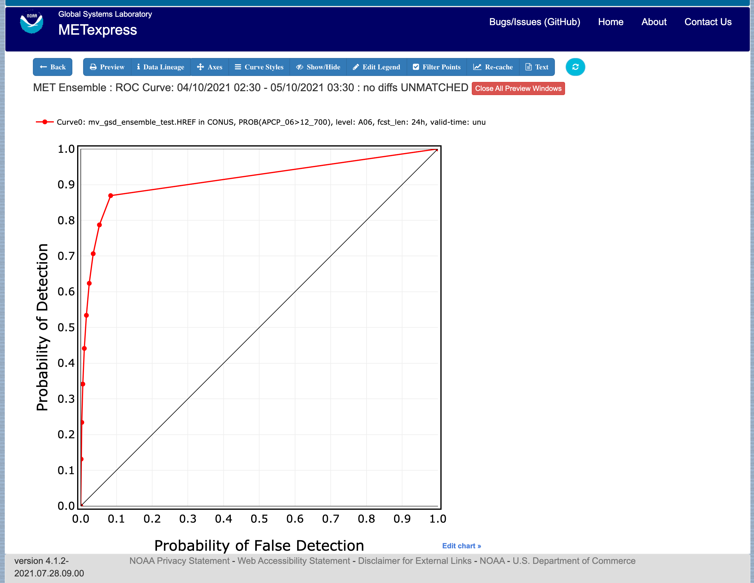
Figure 4.17 Ensemble app ROC plot for the same data set defined in Figure 4.16.
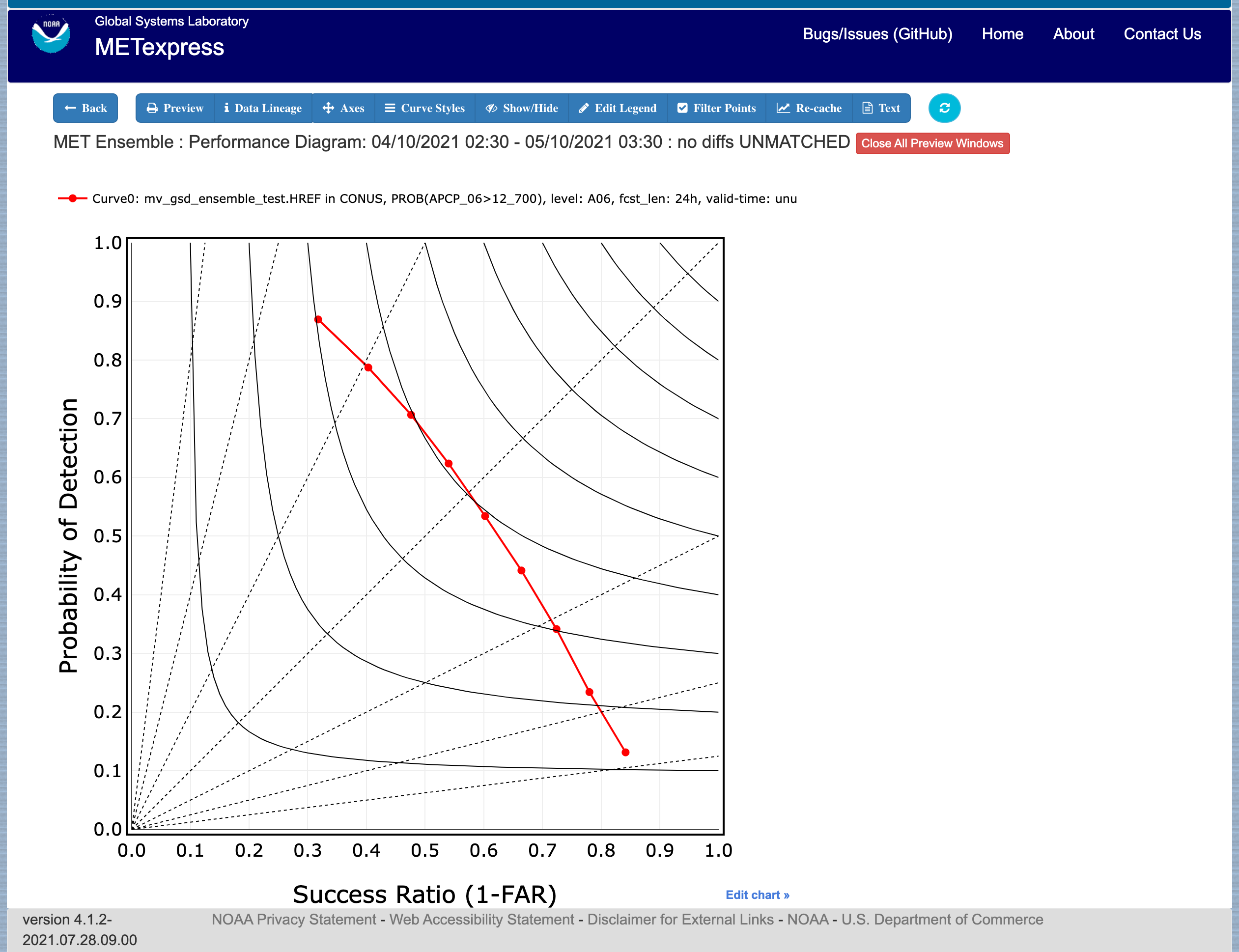
Figure 4.18 Ensemble app Performance Diagram for the same data set defined in Figure 4.16.
4.6. Precipitation App
The Precipitation app is designed for plotting scalar and contingency table statistics for variables relating to precipitation.
For this app, the following parameters have choices derived from the data.
Group
Database
Data-source
Region
Statistic
Variable
Threshold
Interp-Method
Scale
Obs type
Forecast lead time
Level
Description
Dates
Curve-dates
The selector for the Statistic has these possible choices (depending on available MET line types):
CSI
FAR
FBIAS
GSS
HSS
PODy
PODn
POFD
FSS
RMSE
Bias-corrected RMSE
MSE
Bias-corrected MSE
ME (Additive bias)
Fractional Error
Multiplicative bias
Forecast mean
Observed mean
Forecast stdev
Observed stdev
Error stdev
Pearson Correlation
Plot types available include
Time Series
Dieoff
Threshold
ValidTime
GridScale
Histogram
Contour
Plots in the Precipitation app for Time Series, Dieoff, ValidTime, Histogram, and Contour are the same as in Upper Air.
A different plot type, Threshold, is present in this app. Threshold plots display threshold on the x-axis, and the mean value of the selected parameter on the y-axis.
Another unique plot type, GridScale, is included in this app. GridScale plots display grid scale on the x-axis, and the mean value of the selected parameter on the y-axis.
Figure 4.19 shows an example of the user interface for the Precipitation app, Figure 4.20 shows an example Threshold plot, and Figure 4.21 shows an example GridScale plot.
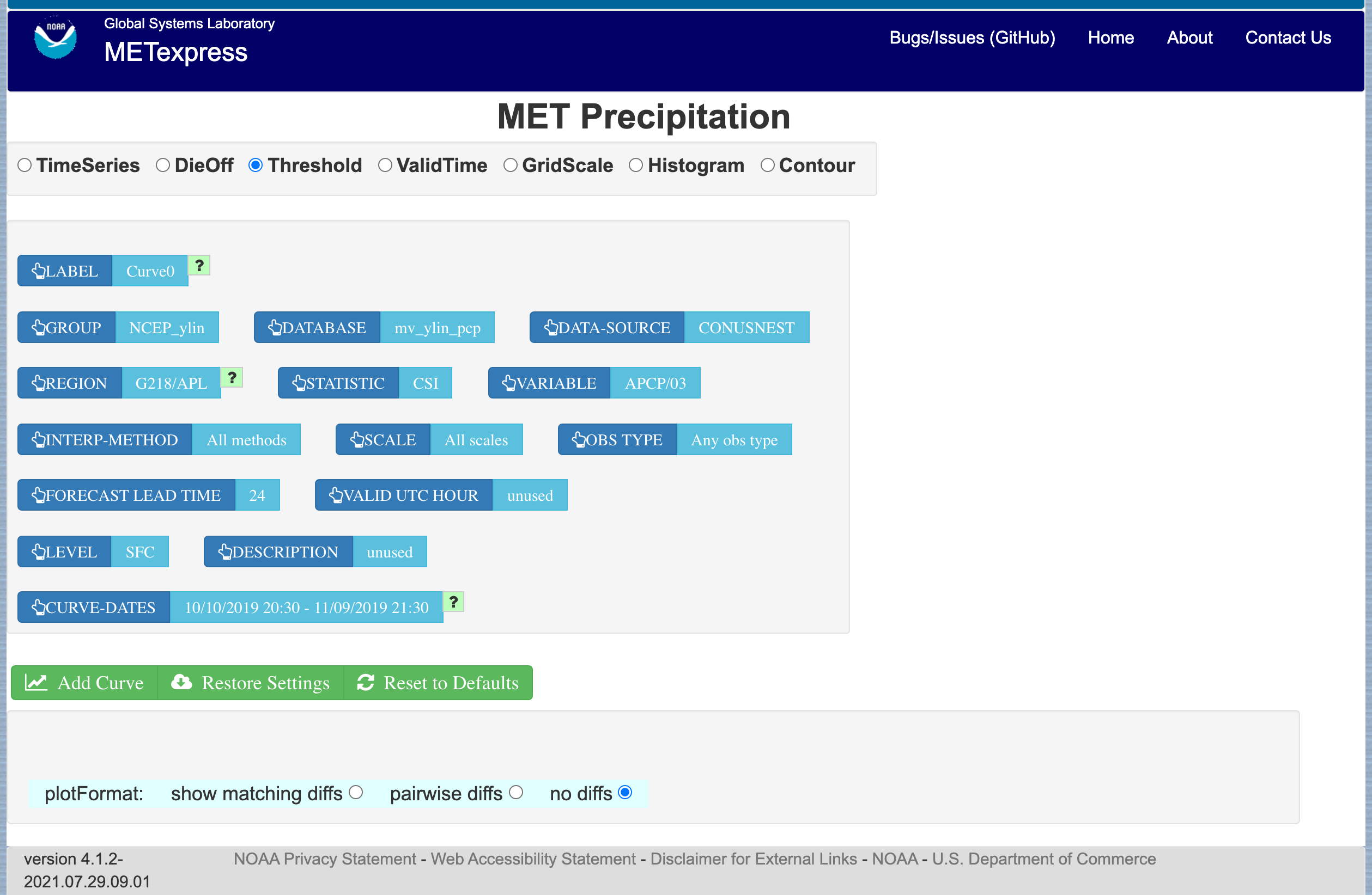
Figure 4.19 User interface screen for a Threshold plot in the Precipitation app
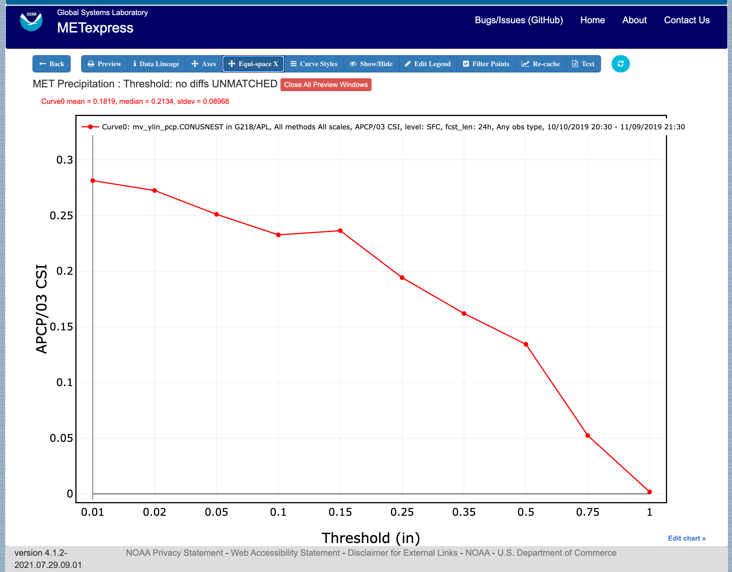
Figure 4.20 Threshold plot in the Precipitation app produced from selections in Figure 4.19
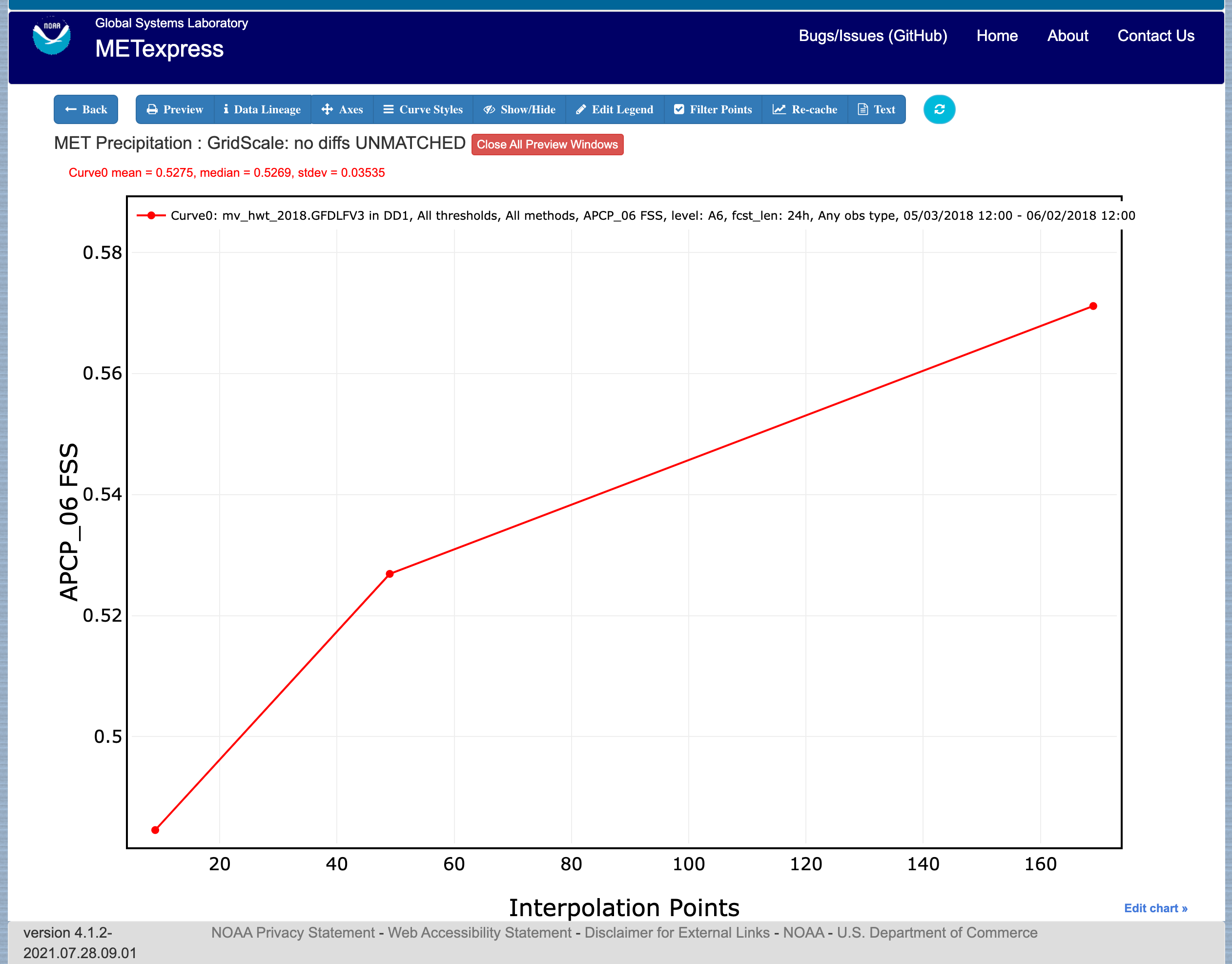
Figure 4.21 GridScale plot in the Precipitation app produced from selections in Figure 4.19
4.7. Cyclone App
The Cyclone app is designed for plotting track and intensity verification statistics for both tropical and extratropical cyclones.
For this app, the following parameters have choices derived from the data.
Group
Database
Data-source
Basin
Statistic
Year
Storm
Truth
Forecast lead time
Storm classification
Description
Dates
Curve-dates
The selector for the Statistic has these possible choices (depending on available MET line types):
Track error
X error
Y error
Along track error
Cross track error
Model distance to land
Truth distance to land
Model-truth distance to land
Model MSLP
Truth MSLP
Model-truth MSLP
Model maximum wind speed
Truth maximum wind speed
Model-truth maximum wind speed
Model radius of maximum winds
Truth radius of maximum winds
Model-truth radius of maximum winds
Model eye diameter
Truth eye diameter
Model-truth eye diameter
Model storm speed
Truth storm speed
Model-truth storm speed
Model storm direction
Truth storm direction
Model-truth storm direction
RI start hour
RI end hour
RI time duration
RI end model max wind speed
RI start truth max wind speed
RI end truth max wind speed
RI truth start to end change in max wind speed
RI truth maximum change in max wind speed
Plot types available include
Time Series
Dieoff
ValidTime
YearToYear
Histogram
Plots in the Cyclone app for Time Series, Dieoff, ValidTime, and Histogram are the same as in Upper Air.
A different plot type, YearToYear, is present in this app. YearToYear plots display individual years on the x-axis, and the mean value of the selected statistic for each year on the y-axis. This is useful for seeing how forecast quality has changed from year to year for each ocean basin.
Figure 4.22 shows an example of the user interface for the Cyclone app, and Figure 4.23 shows an example YearToYear plot.
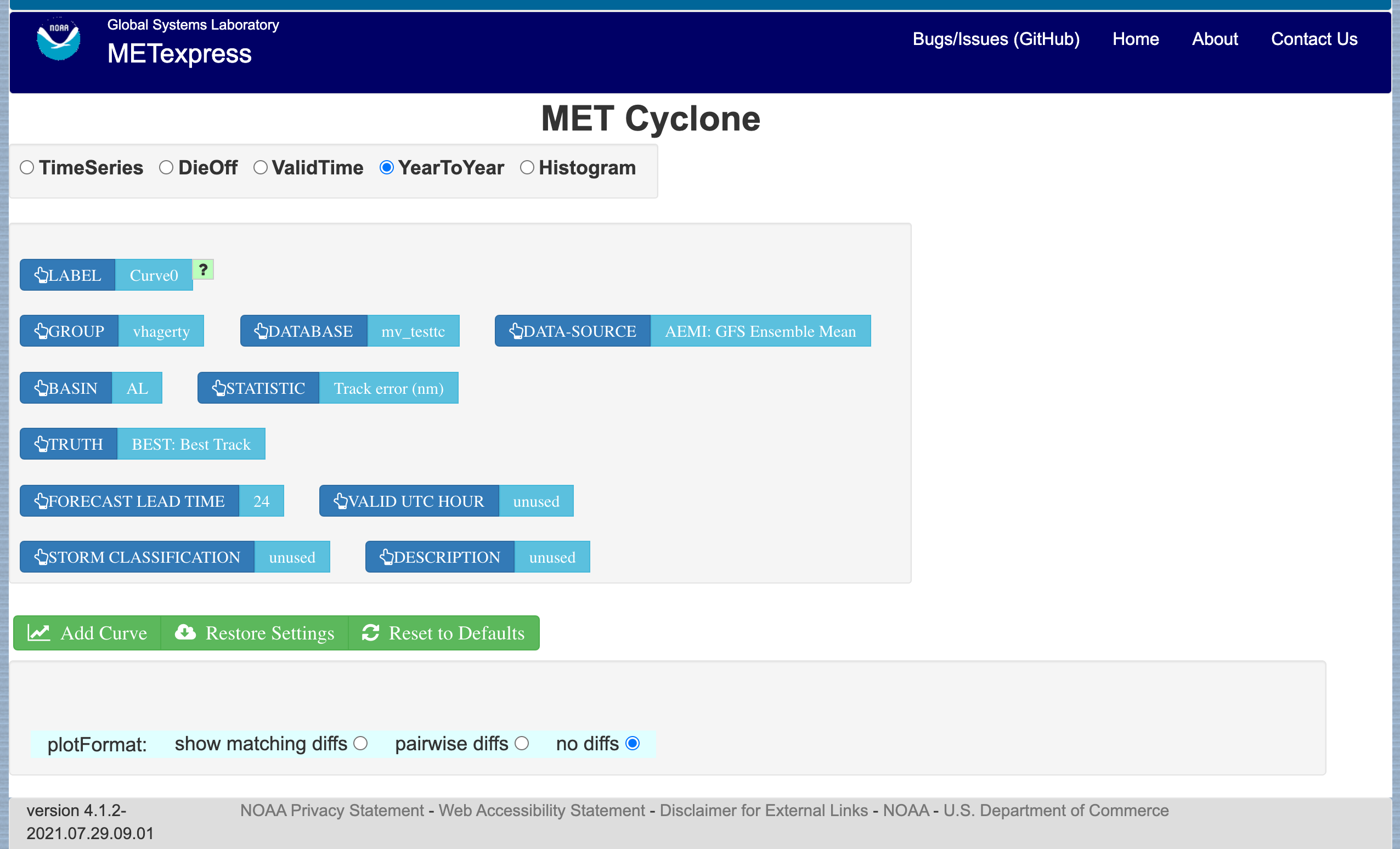
Figure 4.22 User interface screen for a YearToYear plot in the Cyclone app
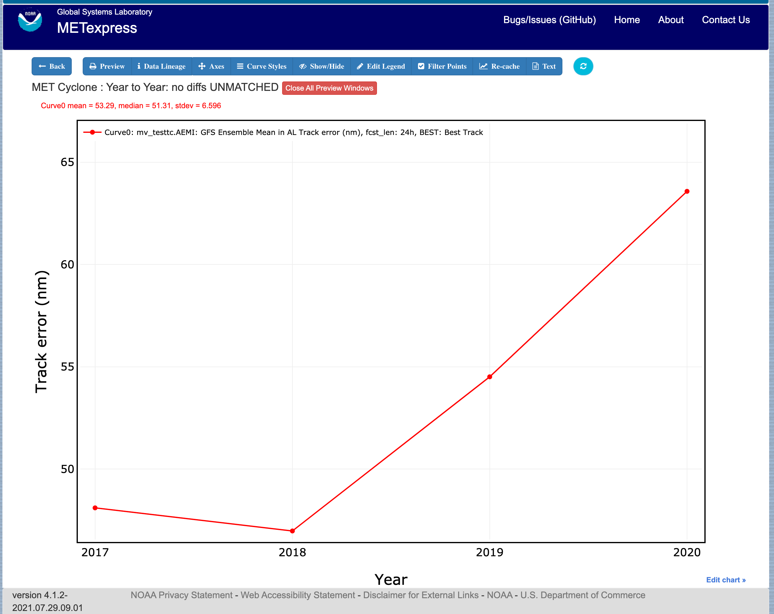
Figure 4.23 YearToYear plot in the Cyclone app produced from selections in Figure 4.22
4.8. Objects App
The Objects app is designed for plotting skill scores and model-obs pair verification statistics for convective objects.
For this app, the following parameters have choices derived from the data.
Group
Database
Data-source
Statistic
Variable
Threshold
Radius
Scale
Forecast lead time
Level
Description
Dates
Curve-dates
The selector for the Statistic has these possible choices (depending on available MET line types):
Model-obs centroid distance
Model-obs centroid distance (unique pairs)
Model-obs angle difference
Model-obs aspect difference
Model/obs area ratio
Model/obs intersection area
Model/obs union area
Model/obs symmetric difference area
Model/obs consumption ratio
Model/obs curvature ratio
Model/obs complexity ratio
Model/obs percentile intensity ratio
Model/obs interest
OTS (Object Threat Score)
MMI (Median of Maximum Interest)
CSI (Critical Success Index)
FAR (False Alarm Ratio)
PODy (Probability of positive detection)
Object frequency bias
Ratio of simple objects that are forecast objects
Ratio of simple objects that are observation objects
Ratio of simple objects that are matched
Ratio of simple objects that are unmatched
Ratio of simple forecast objects that are matched
Ratio of simple forecast objects that are unmatched
Ratio of simple observed objects that are matched
Ratio of simple observed objects that are unmatched
Ratio of simple matched objects that are forecast objects
Ratio of simple matched objects that are observed objects
Ratio of simple unmatched objects that are forecast objects
Ratio of simple unmatched objects that are observed objects
Ratio of forecast objects that are simple
Ratio of forecast objects that are cluster
Ratio of observed objects that are simple
Ratio of observed objects that are cluster
Ratio of cluster objects that are forecast objects
Ratio of cluster objects that are observation objects
Ratio of simple forecasts to simple observations (frequency bias)
Ratio of simple observations to simple forecasts (1 / frequency bias)
Ratio of cluster objects to simple objects
Ratio of simple objects to cluster objects
Ratio of forecast cluster objects to forecast simple objects
Ratio of forecast simple objects to forecast cluster objects
Ratio of observed cluster objects to observed simple objects
Ratio of observed simple objects to observed cluster objects
Area-weighted ratio of simple objects that are forecast objects
Area-weighted ratio of simple objects that are observation objects
Area-weighted ratio of simple objects that are matched
Area-weighted ratio of simple objects that are unmatched
Area-weighted ratio of simple forecast objects that are matched
Area-weighted ratio of simple forecast objects that are unmatched
Area-weighted ratio of simple observed objects that are matched
Area-weighted ratio of simple observed objects that are unmatched
Area-weighted ratio of simple matched objects that are forecast objects
Area-weighted ratio of simple matched objects that are observed objects
Area-weighted ratio of simple unmatched objects that are forecast objects
Area-weighted ratio of simple unmatched objects that are observed objects
Area-weighted ratio of forecast objects that are simple
Area-weighted ratio of forecast objects that are cluster
Area-weighted ratio of observed objects that are simple
Area-weighted ratio of observed objects that are cluster
Area-weighted ratio of cluster objects that are forecast objects
Area-weighted ratio of cluster objects that are observation objects
Area-weighted ratio of simple forecasts to simple observations (frequency bias)
Area-weighted ratio of simple observations to simple forecasts (1 / frequency bias)
Area-weighted ratio of cluster objects to simple objects
Area-weighted ratio of simple objects to cluster objects
Area-weighted ratio of forecast cluster objects to forecast simple objects
Area-weighted ratio of forecast simple objects to forecast cluster objects
Area-weighted ratio of observed cluster objects to observed simple objects
Area-weighted ratio of observed simple objects to observed cluster objects
Plot types available include
Time Series
Dieoff
Threshold
ValidTime
Plots in the Objects app for Time Series, Dieoff, and ValidTime are the same as in Precipitation.
Figure 4.24 shows an example of the user interface for the Objects app.
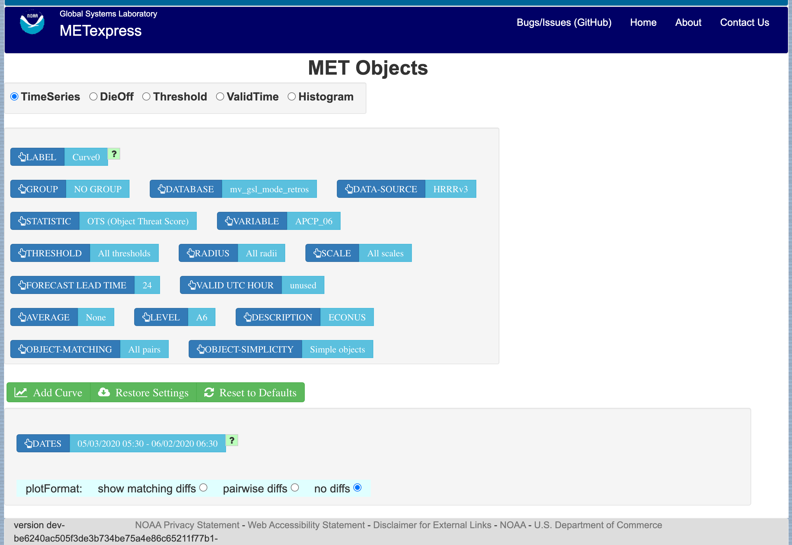
Figure 4.24 User interface screen for the Objects app